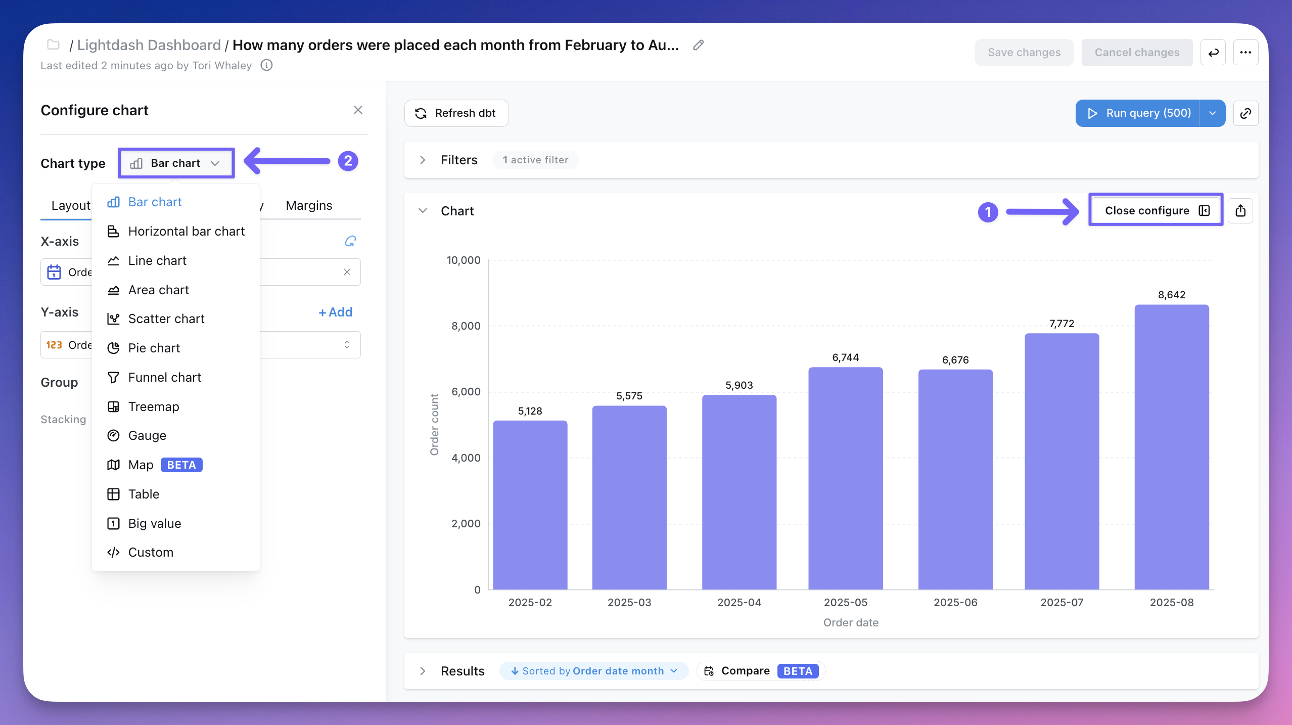
Chart types overview
Every visualization type available in Qyra and when to reach for each one
In Qyra, the data in your results tables can be visualized in a bunch of different ways.
Custom is one entry in the chart type menu covering two kinds of chart. A Vega chart is a one-off spec written in a JSON editor and belongs to that chart alone. A project chart type is reusable: you describe the chart you want, Qyra builds it, and anyone in the project can then apply it like a built-in chart type.
The visualization type that you pick determines how Qyra shows the data series in your chart. To change how your data is displayed, click Configure when you're querying from a table. You have the option to change the chart type in the drop-down: